Swim Creative recently announced the unveiling of a new logo for the American Optometric Student Association to celebrate its 50th Anniversary. It was about one year ago that the process began. The project was wrapped up about six months ago, but we wanted the reveal to wait until the Optometry’s Meeting (June 20-24, 2018) in Denver, Colorado. This gave us time to fully prepare standards and versioning for the various schools that would be using the logo. It also gave the client time to prepare fanfare to give the new logo the attention it deserves. This was a fun project and I learned a few things along the way.
- I’m old. Well, maybe that’s a relative term. Maybe my client was young. After all, most of the board was in their mid-to-late twenties, including the executive council. Their age – or professional perspective (I prefer to say) – might be one of the key factors in Swim being awarded the work, actually. Why? The “client” was comprised of a group of people that searched for an agency that was the right fit for them – regardless of its office location. It was wonderful to work alongside bright and energetic professionals who were passionate about their industry and eager to learn about the branding process. This fueled important conversations and inspired key insights that were critical to the development of an effective identity piece. It was a great combination.
- Client personnel turnover is inevitable. But if you do great work, your relationship will not just survive, but flourish. Our client contact changed a few times. This is the nature of professional organizations and it is to be expected as new board members are elected. As a matter of fact, we will be saying goodbye to the outgoing executive council of the AOSA as they move on to start their careers. At the same time, we will be saying hello to the EC as we begin working on new projects together.
- Don’t be afraid of a fifty-person board. Especially if the board has good leadership and has the right tools and ground rules to use clear thinking to make swift decisions. I was amazed at how the group understood its role, applied itself where and when appropriate, and then moved on. Honestly, I don’t think they wanted to spend hours and hours debating kerning. They stayed out of the weeds. Oh, and when the executive council wanted them to vote, the president sent a ballot to board member’s phones. I was scared at first: “No voting!” But my fear was replaced by amazement as I watched how quickly they came to a decision.
- Clients who like to learn will have a positive experience. These are students, after all. When we would finish our large group presentations, we would have a half dozen board members approach with questions about the branding process. Because these were healthcare students, they were particularly interested in the science behind what we did and the strategy behind the decisions we made. They were objective rather than subjective and worked with us to come to solutions. By understanding how we do what we do, they were able to dovetail into that process and help things move along smoothly. They were excellent, gracious hosts and we learned a lot, too.
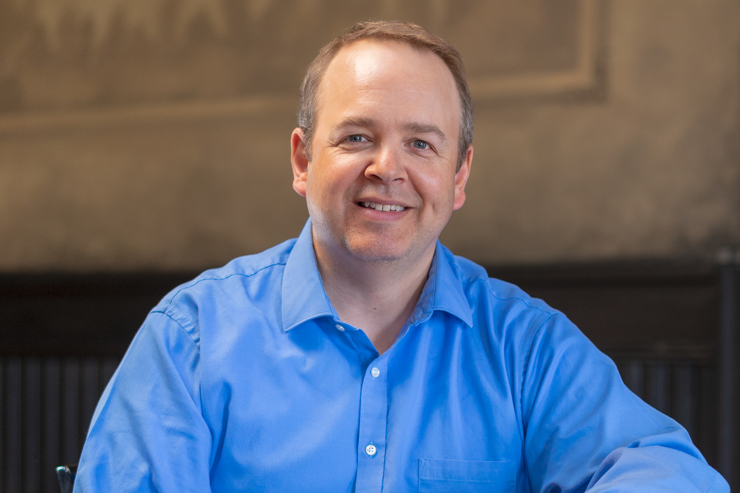
- David Sadowski, our brand director and the lead designer on the project, is good at his job. Technically, this was not something I learned as much as it was a reaffirmation of his skill. He is one hard-working dude and it shows. When you travel with someone, you learn about them. He makes preparation a focus. Not just to have a great song and dance, but to respect our client’s resources and be as productive as possible with the time we have on a very busy agenda. David presented the work and he did so in a way that the group understood. They got it. He and the team knocked it out of the park. He made the process and the work relatable, which made my job as account director pretty damn easy.
- Long distance relationships can (and do) work well. Swim is located about 150 miles north of Minneapolis in Duluth, Minnesota. AOSA’s headquarters are in St. Louis, Missouri, with an executive council that is spread out across the United States. We presented a branding document during a conference in Chicago and then the final logo options were presented at the AOSA Annual Meeting in Jacksonville, Florida. We hosted zoom meetings and conference calls along the way. Basecamp and emails kept us connected. The more I think about it, long distance relationships are pretty fun. So, agencies: don’t limit your service radius to your own neighborhood. And, clients: consider working with an agency that is the perfect fit for you regardless of geography.
Helping companies and organizations best represent their brands has always been a rewarding part of what we do. The AOSA project is particularly exciting for Swim Creative not just because of what was done, but how it was done. Through respect, collaboration, process, insightfulness, talent and ingenuity, we worked as a team to develop a logo that will take care of them for the another 50 years.
Curious to see the final product? Check out this brief look into all the versions we made before we found the one: