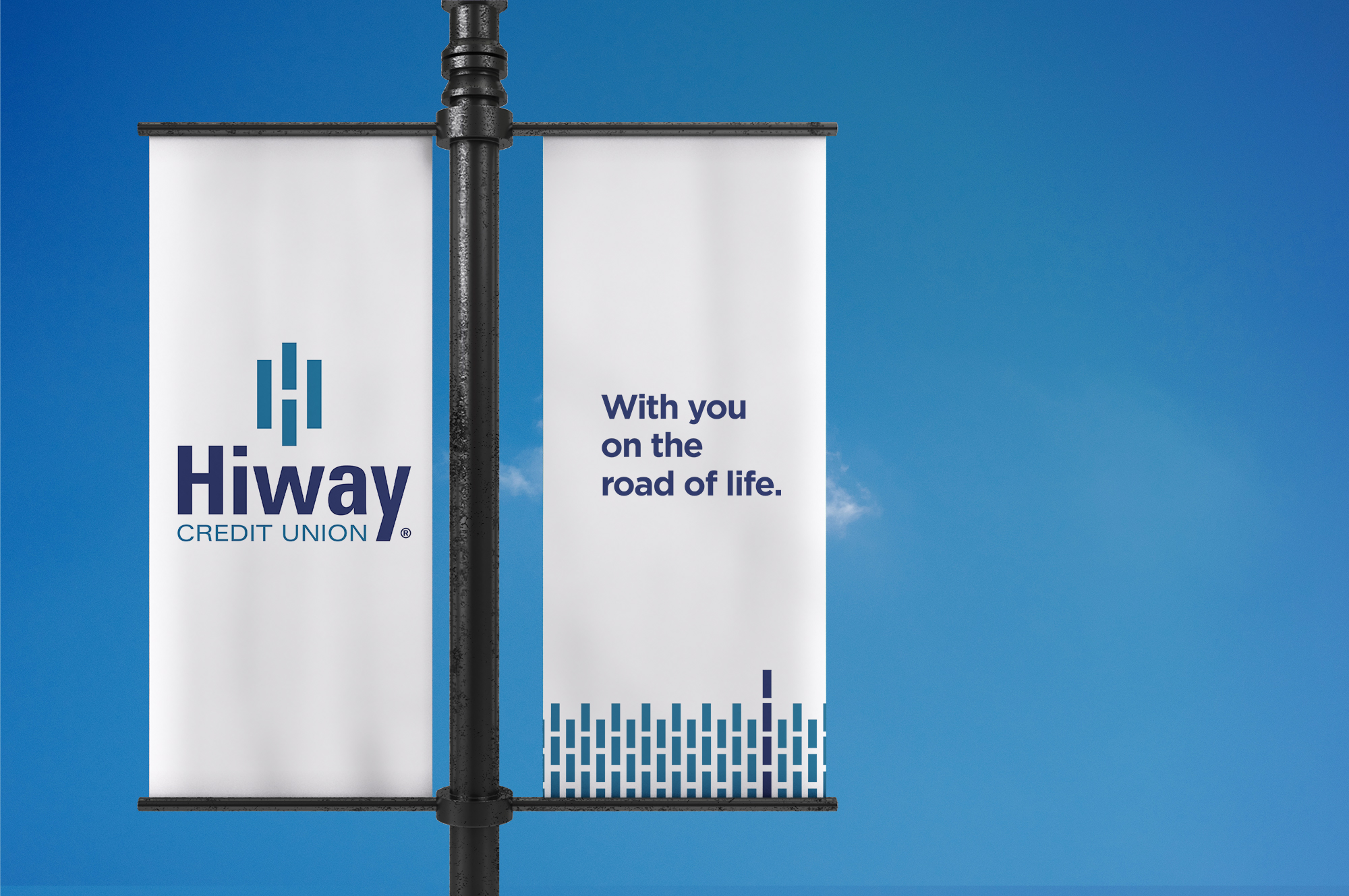
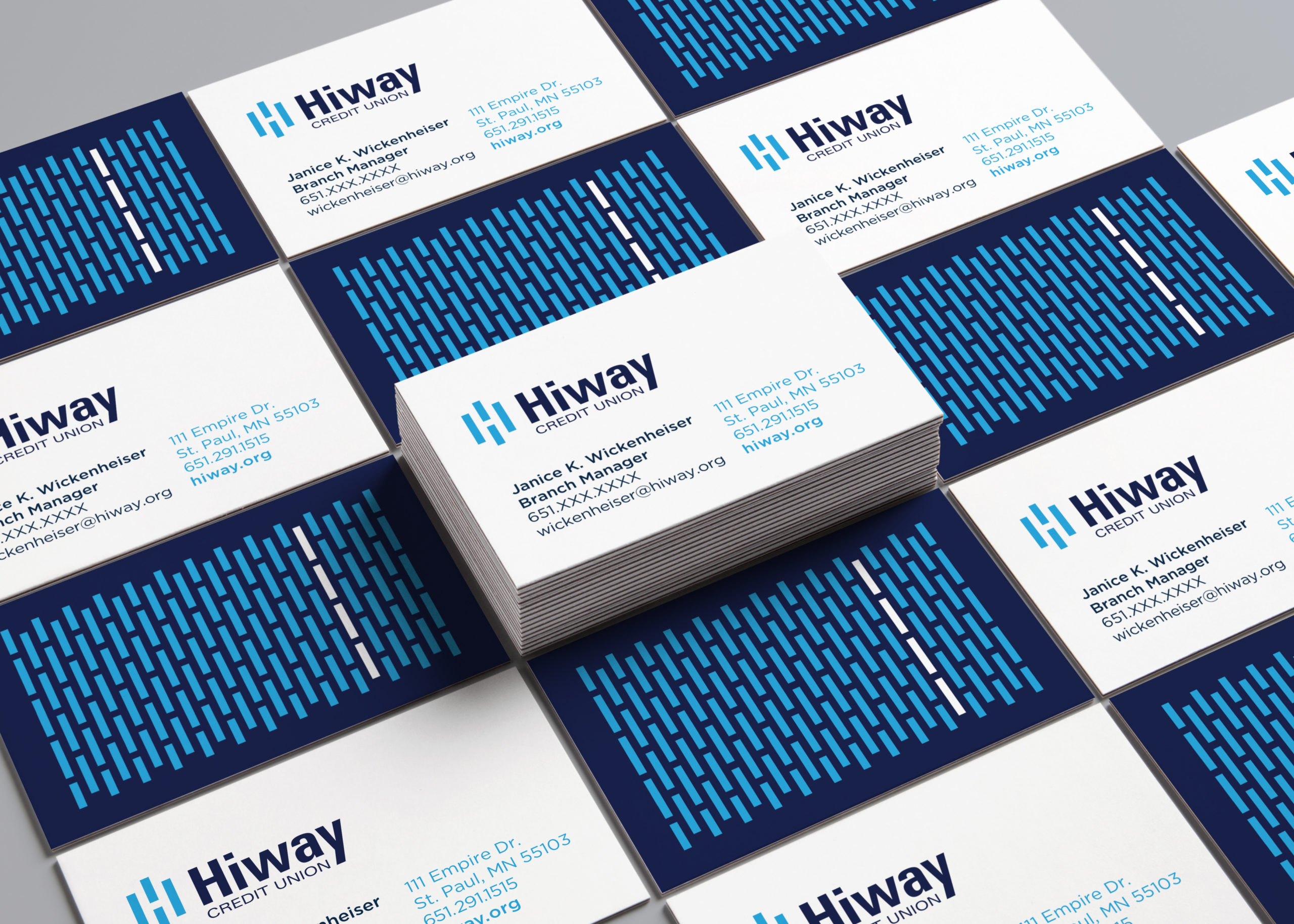
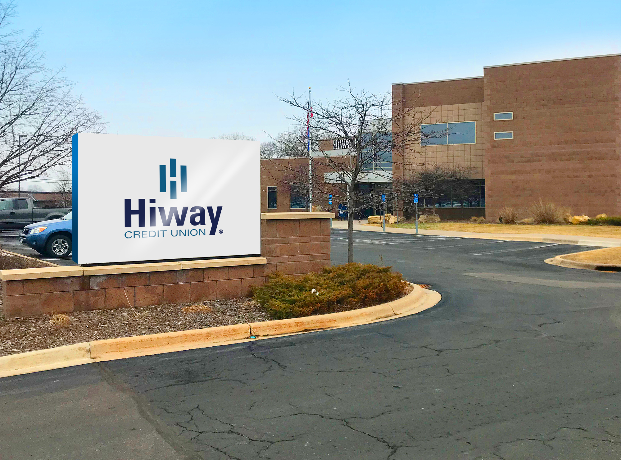
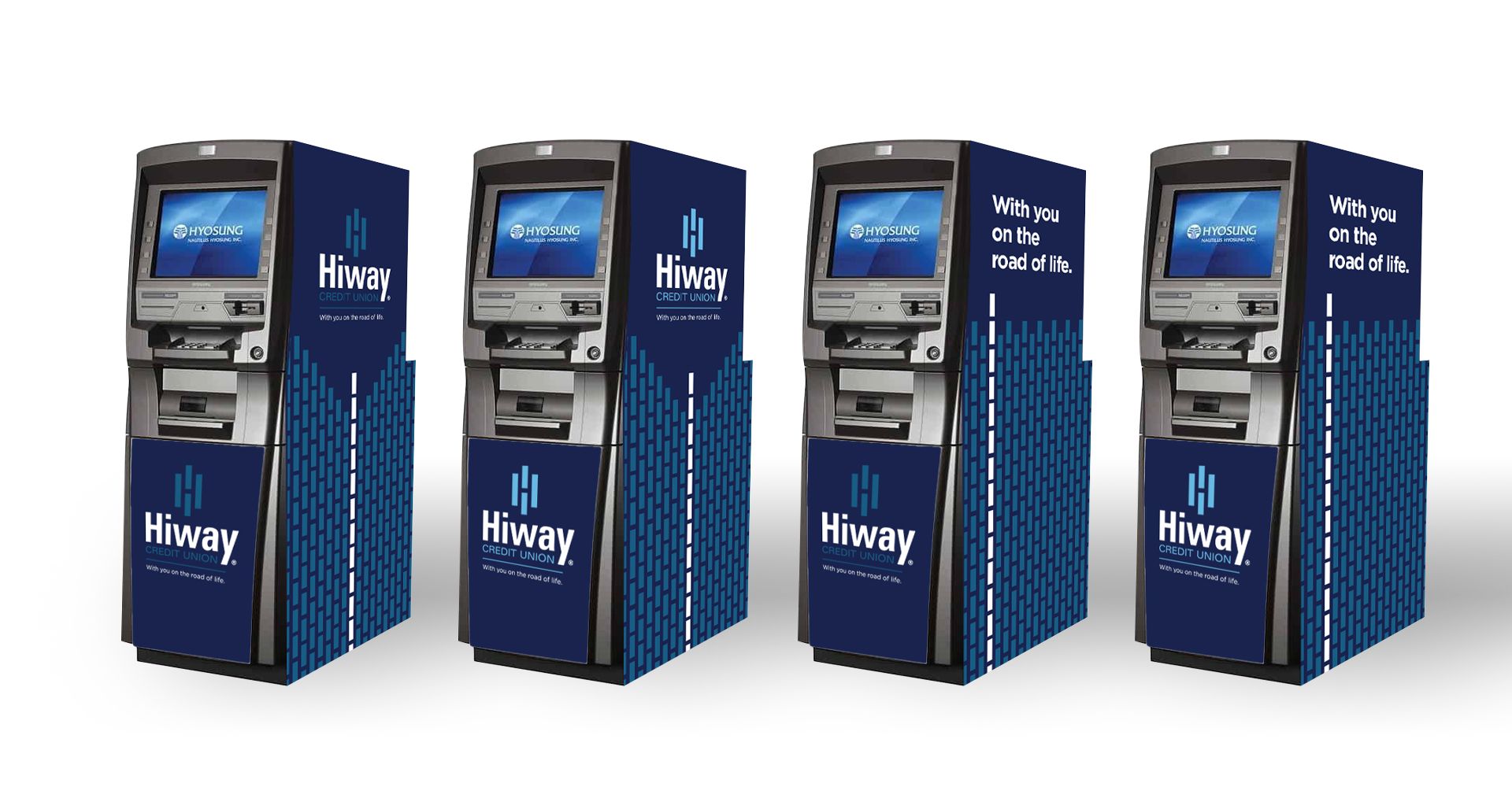
Hiway Credit Union has long been a pillar in the Twin Cities community. They have supported the working class, the MnDOT and the Highway Patrol (thus the name, Hiway); doing so for the past 80+ years. In 2020, Hiway changed from a Federal to a Minnesota charter and dropped “Federal” from their name. With this alteration, they needed a new logo and brand standards. They called on Swim, who has been long-time partners with Hiway. We knew that their commitment to their community was an inherent value. Like the strong-mindedness of the Minnesota Department of Transportation in the Minnesota winters, we redesigned the logo to be a reflection of that determination and diversity of their community. Taking inspiration from the original logo, we designed a highway with strong dashed lines and combined it with the essence of the “H” of Hiway in the negative space. The new logo took home Category’s Best along with winning honors in Rebranding and Identity at the 2021 CUNA Awards.
![]()
![]()